


At Woven, we are always excited to display our latest products and services and this time around, is no exception. We have just released our new Avenue templates, which not only offer a brand new fresh look, feel and design, they involve the use of cutting edge, best practice web development framework focused on a cohesive user experience.
Our templates offer full width screen design, maximising the user experience of your website on larger devices by taking full advantage of larger screen sizes. The design automatically allows any website to be resized to allow for more content above the fold on bigger screens.
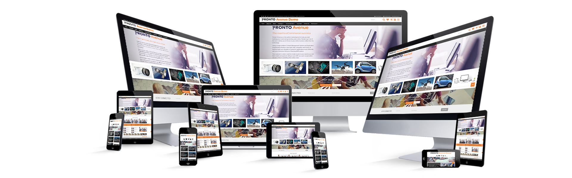
Additionally, our new designs are built and designed with a mobile experience at the forefront. The rising popularity of mobile devices and usage is very well documented. If you don’t have a mobile friendly website, you’re potentially losing a decent amount of customers before they’ve even had the chance to learn more about your products and services.
There is no doubt you would have come across a website in your time that either didn’t have a mobile version at all, or had a poor solution that involved lots of scrolling and loading issues. These days, people are more time poor than ever and if you’re not allowing your customers to view your website at its best on a mobile device while they’re commuting, waiting for an appointment or perhaps, enjoying TV at the end of a long day, you're really missing out on the ability to reach as many customers as possible.
Our mobile friendly designs come complete with several new technologies, including Google Material Design and Twitter’s Bootstrap infrastructure. If you ask us, the latter is the most popular and best practice responsible framework in the marketplace today. Both technologies work in conjunction with one another to facilitate a unified experience across devices.
Below, we’ve put together some more in-depth information about these two technologies:
Google Material Design: improves user experience by standardising a user’s experience across all web platforms and applications. It does so by unifying your website with a rich set of design styles and principles, including grid based layouts, responsive animations as well as transitions.
Twitter Bootstrap: the latest Avenue templates showcase updated bootstrap technology and in particular, Bootstrap CSS. This allows for unified experience across responsive devices by supplying a best practice media library for Avenue to reference. This enables Avenue to easily resize each image according to a range of the most popular devices. The end result: a cohesive user experience within Avenue and right across the web.
As you’ve read here, we have good reason to be excited about our new Avenue templates. We’ve really taken ecommerce website design to another level in so many ways and customers already using the templates, are seeing a huge difference in their website’s performance and ROI.
These new Avenue templates are available for implementation now. As always, our team is dedicated to working alongside you to determine which templates are most suitable for your unique business needs. Contact us today to discuss upgrading to our new Avenue templates.
